Ahh, Data Is Beautiful (35 Charts)
I think one of the most satisfying things in the world is a well-made chart. There’s something about being able to convey interesting data is such an efficient way that is absolutely fascinating. It also makes me really happy these people are out there and not everyone is as dumb as me.
1.
Cause of Death – Reality vs. Google vs. Media [OC] from r/dataisbeautiful
2.
Gaze and foot placement when walking over rough terrain (article link in comments) [OC] from r/dataisbeautiful
3.
4. “I recorded my travels as a professional truck driver since 2012.”

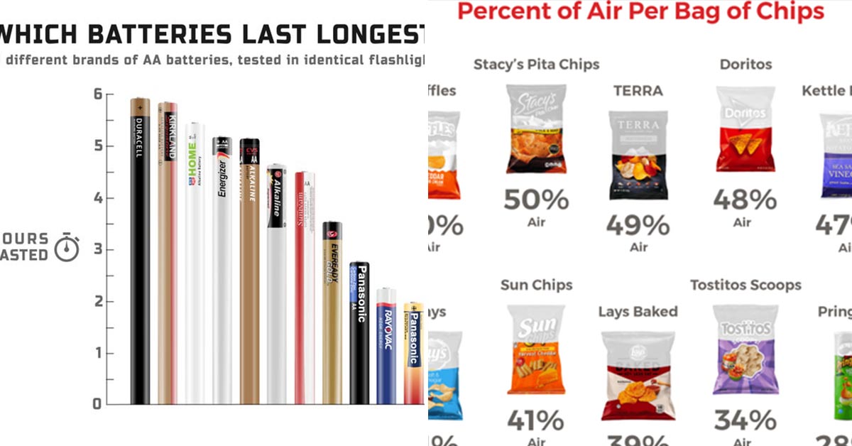
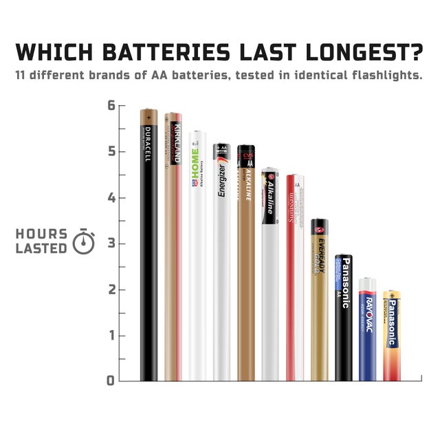
5. 11 different brands of AA batteries, tested in identical flashlights.
6.
[OC] Hours of daylight as a function of day of the year and latitude from r/dataisbeautiful
7.
The City is Alive: The Population of Manhattan, Hour-by-Hour [OC] from r/dataisbeautiful
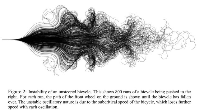
8. Paths of 800 unmanned bicycles being pushed until they fall over.
9.
Usage Share of Internet Browsers 1996 – 2019 [OC] from r/dataisbeautiful
10.
[OC] I cycled through all the streets Central London from r/dataisbeautiful