22 Charts And Graphs That Show A Different Perspective Of The World
Data is beautiful when it’s put into the form of a chart or a graph. It makes it easy for someone like me to understand what the heck you’re talking about.
Even if you don’t fully understand what they’re about, they’re still cool to look at. See for yourself.
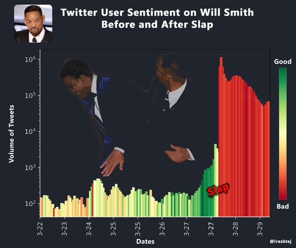
1. “Twitter Sentiment On Will Smith Before and After Slap”
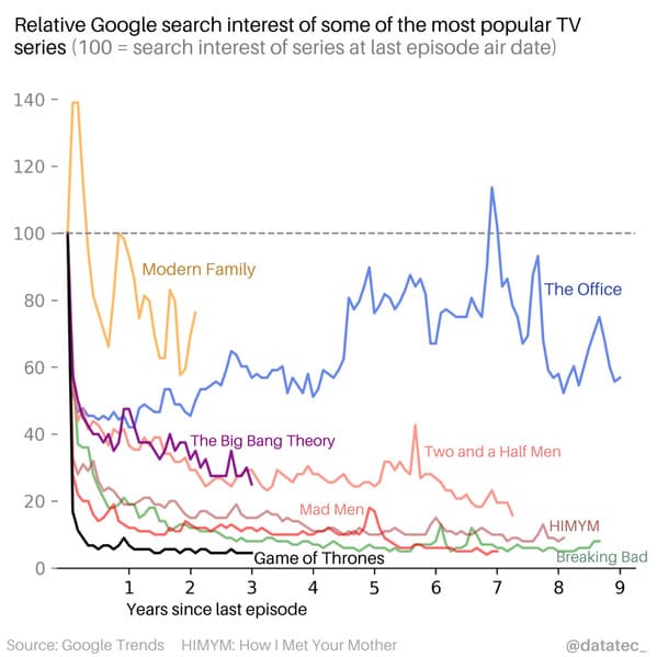
2. “Relative Google search interest of popular TV series after last episode air date”
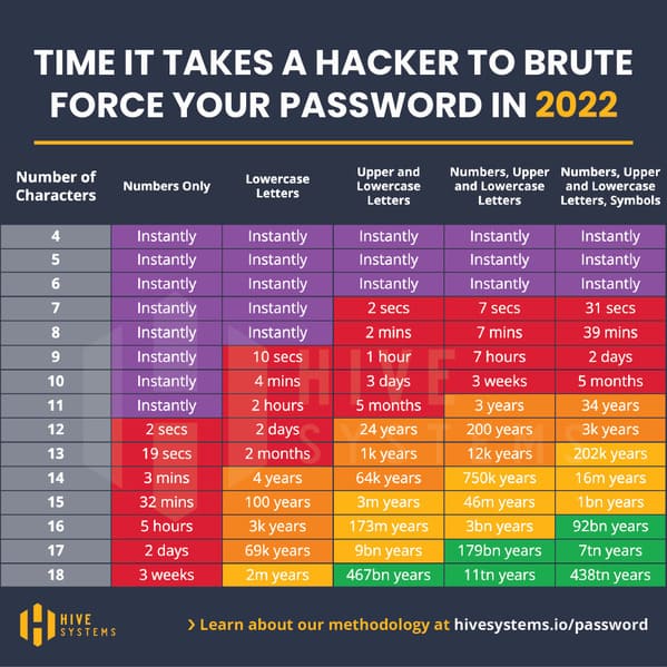
3. “I updated our famous password table for 2022”
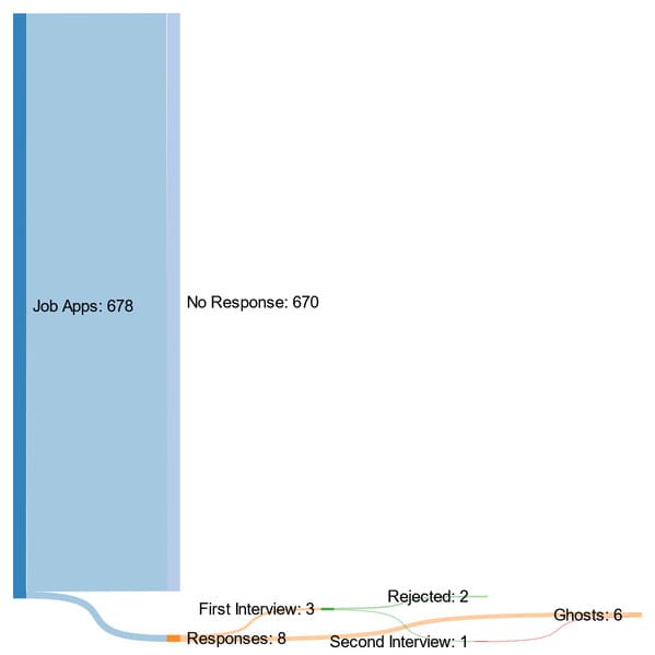
4. “What job hunting has been like as a 2020 graduate so far”
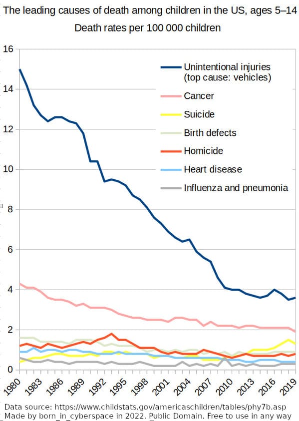
5. “The leading causes of death among children in the US, ages 5–14”
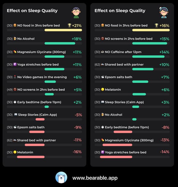
6. “My GF and I tracked the effect of 10 different 30-day Sleep Quality experiments over the last 18 months.”
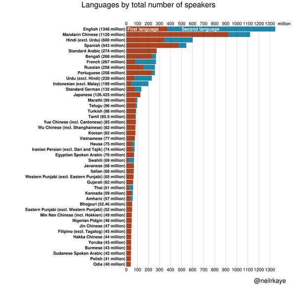
7. “Most spoken languages in the world”
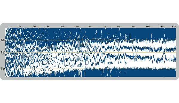
8. “My daughter’s complete first year of sleep”
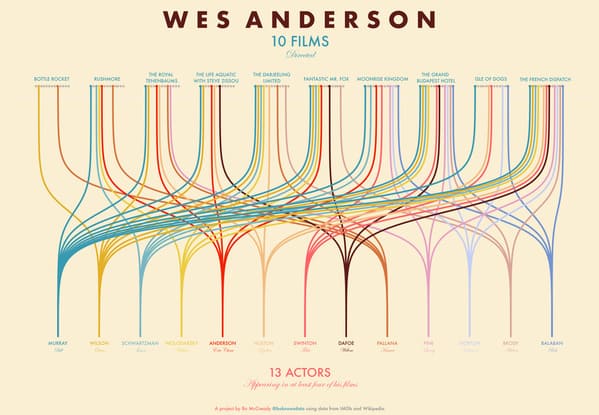
9. “Wes Anderson Films and Their Actors”
10. “Earth’s surface area by type/usage”

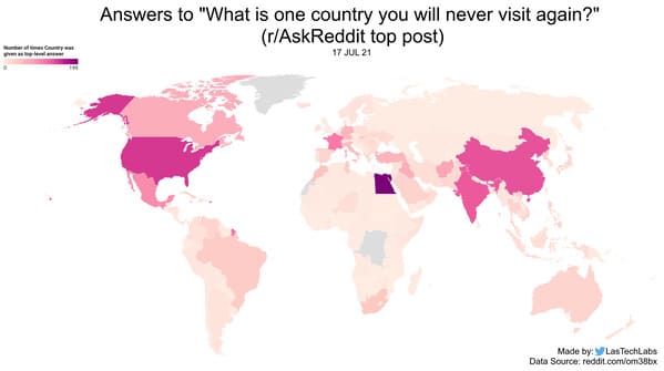
11. “What is one country that you will never visit again?”
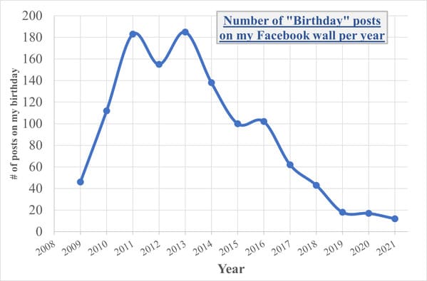
12. “Number of “Birthday” posts on my Facebook wall per year”
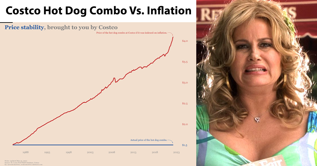
13. “Costco hot dog combo vs inflation”

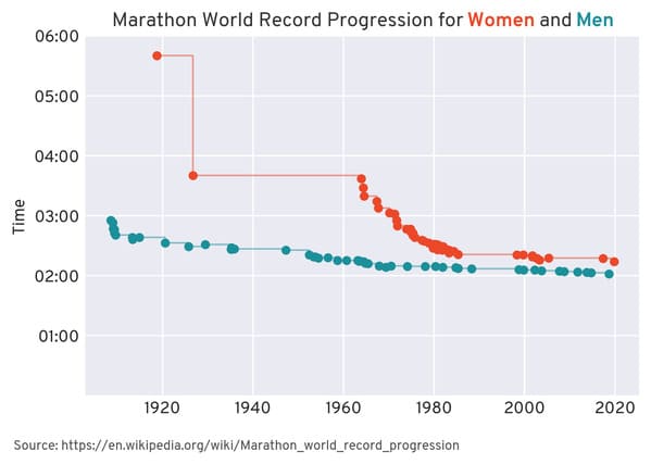
14. “How marathon record times for women and men have changed over the last century”
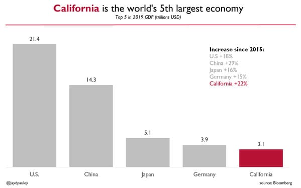
15. “California is the world’s 5th largest economy. Here are the top 5.”
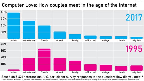
16. “Dating in the internet age: 1995 vs. 2017”
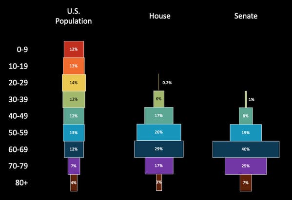
17. “Age Distribution of Congress vs. Overall U.S. Population”
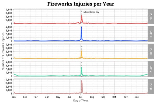
18. “The Pandemic Did Not Reduce July 4 Fireworks Injuries”
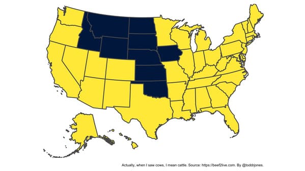
19. “There are more cows than people in the states colored blue.”
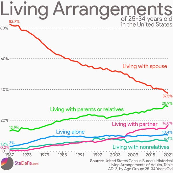
20. “Living Arrangements Trends Of 25-34 Years Old In The United States”
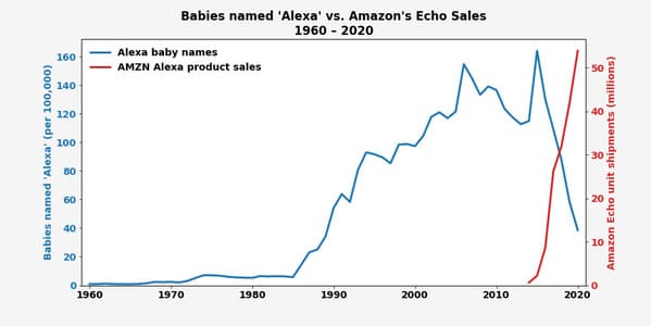
21. “The Rise and Fall (and Rise) of “Alexa”.”
22. “Abortion Deaths in the USA (1968-2018)”

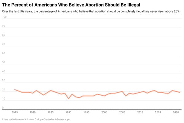
23. “The Percent of Americans Who Believe Abortion Should Be Illegal (1975-2020)”
h/t: r/DataIsBeautiful