Let’s Leave Graph-Making To The Experts Next Time, Okay? (20 Pics)
Unfortunately, there are right and wrong ways to use graphs. You need to have a y-axis and things need to be made on the same scale. When you start looking for them, it’s pretty clear where people let their agendas get in the way of making a good graph.
Here are some atrocious graph crimes (if you can bear to look at them).
1. Huge eye roll for this one.
2. WHERE’S THE Y-AXIS
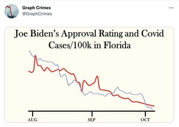
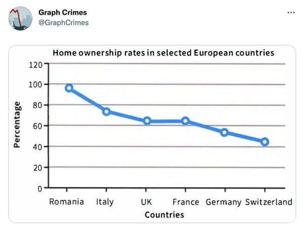
3. How dare you use a line graph like this.
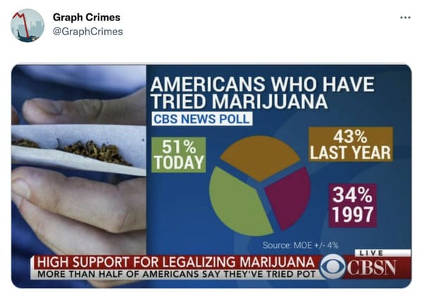
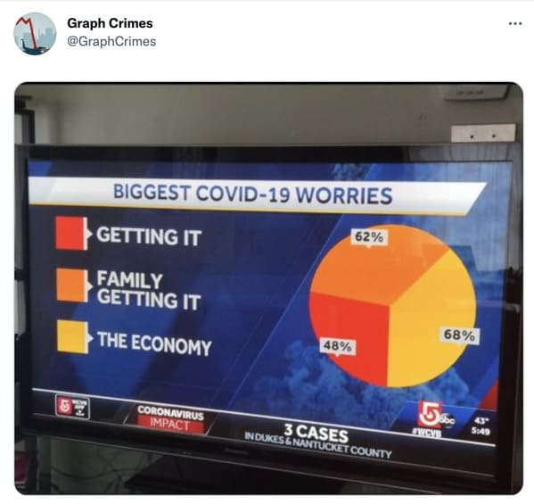
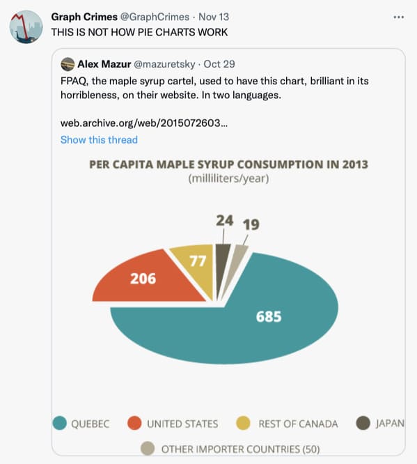
4. Not how pie charts work at all….
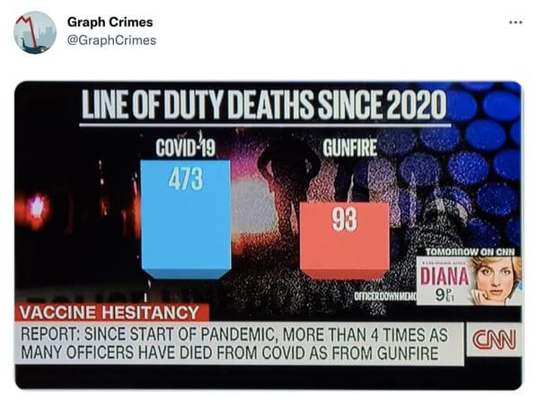
5. This is such a messed up scale.
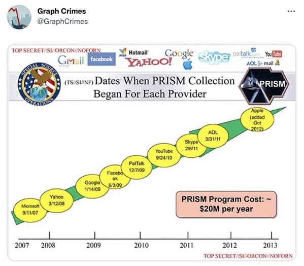
6. The Y-Axis is a government top secret.
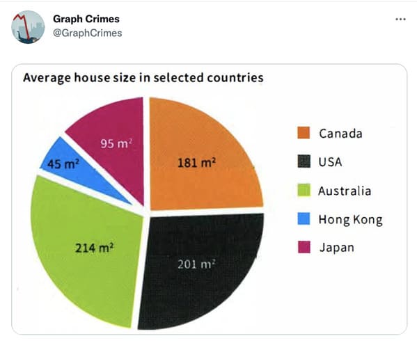
7. This is real pie chart gore.
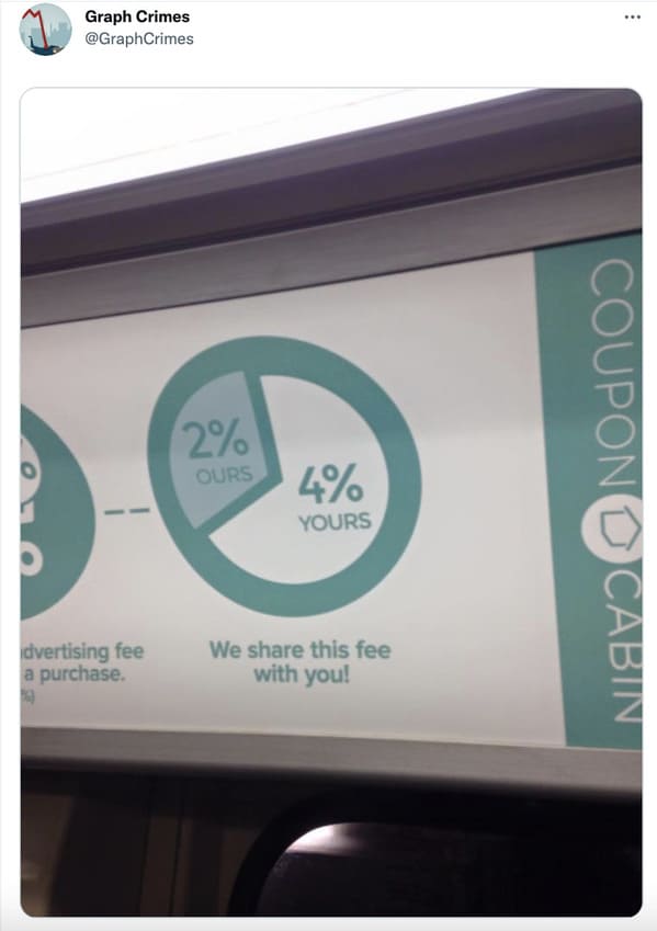
8. This is just NOT how pie charts work.
9. “I guess this one’s straight to the guilliotine”
10. “Unquantifiable Y-Axis. The whole thing is just hot garbage”
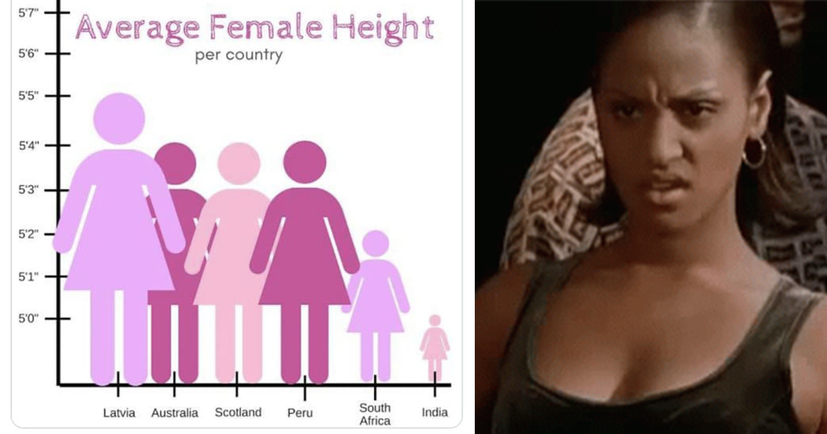
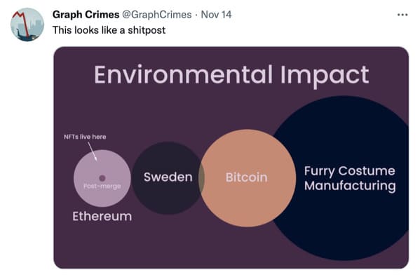
11. Apparently, no one in Sweden manufactures fur suits…?
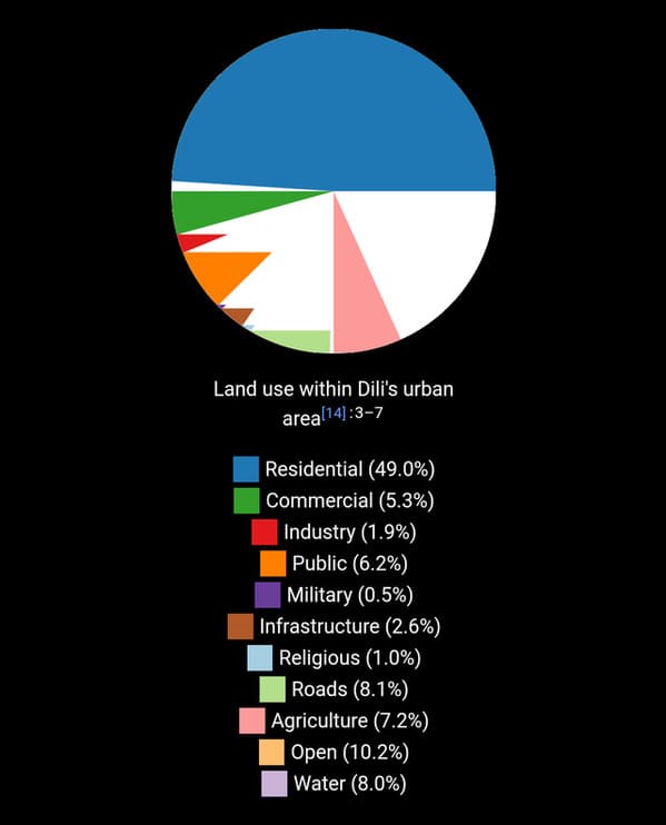
12. “Pie gore on Wikipedia’s “Dili” article”
13. This is in first place for the worst graph I’ve ever seen.
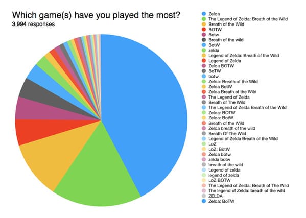
14. “This is why surveys don’t use write-ins”
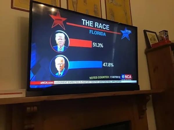
15. “Election day is always a tough time for bar charts”
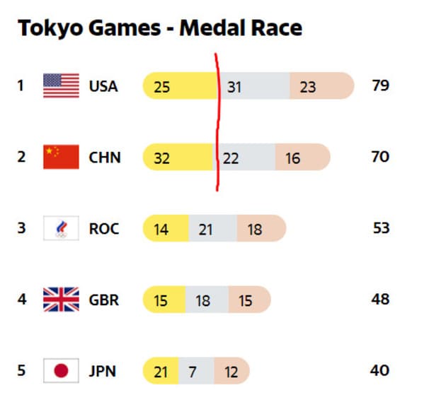
16. “25 USA Gold Medals > 32 Chinese Gold Medals”
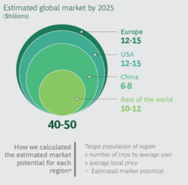
17. “This made my head spin.”
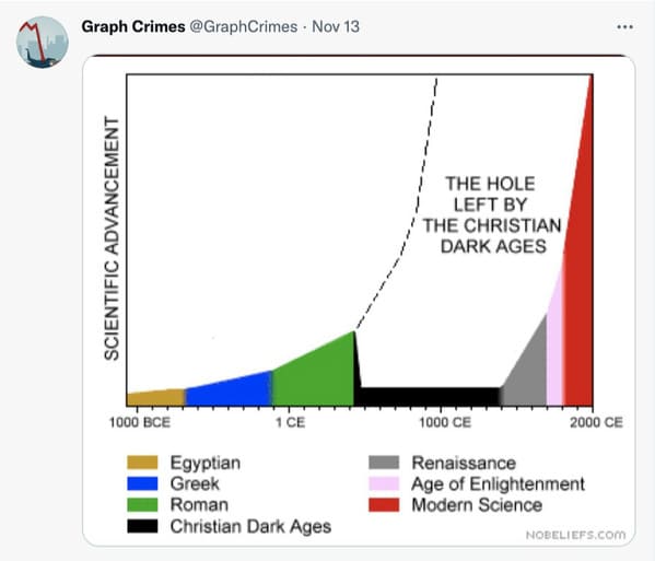
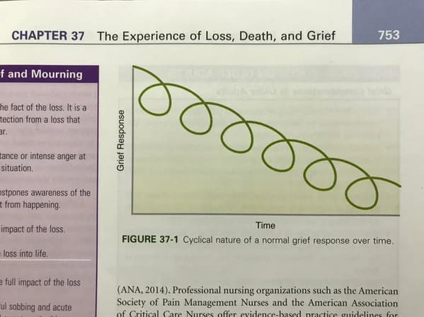
18. “Apparently it’s possible to travel back in time if you are grieving”
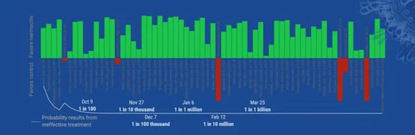
19. “Ivermectin Studies FAIL. Red is Good, Green is Bad.”
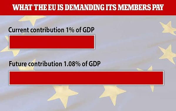
20. “The Daily Mail’s interpretation of 0.08%”