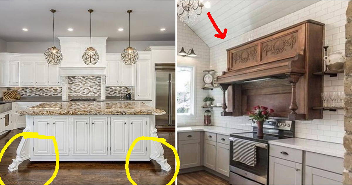
These People Need To Fire Their Kitchen Designer (19 Horrible Kitchens)
Touring new places to live is a unique hell.
Searching for decent things in your price range is a huge hassle and then when you finally find “the one,” there’s almost always something bizarre about it. Kitchens are seen as the most defining parts of a house and messing it up is a mistake that’s expensive to undo.
It’s pretty obvious when a kitchen was designed by someone who doesn’t cook. The stove and sink are way too far apart or there are only 2 outlets in the whole room. These kitchen atrocities are unforgivable and I hope whoever designed them pays for their actions soon.
If you’re looking for some ideas to design a kitchen for someone you hate, look no further.
1. One question: why?
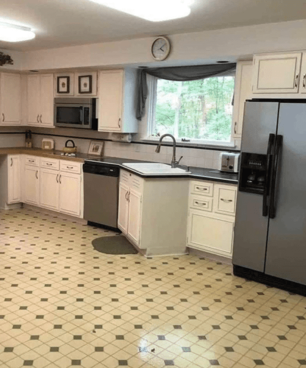
2. This would drive me crazy.
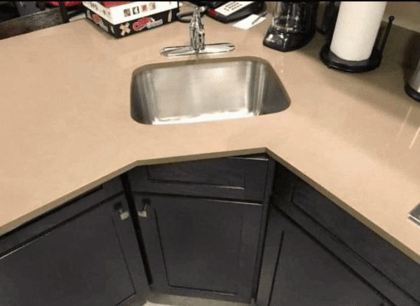
3. Let me overhead press this piping hot Turkey.
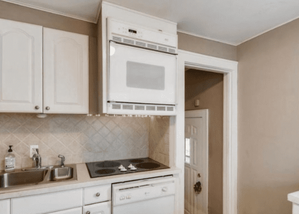
4. I stubbed my toe just looking at this.
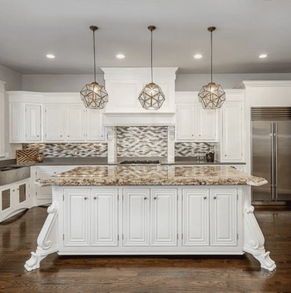
5. Is it cheaper to buy 7 small chandeliers instead of one big one?
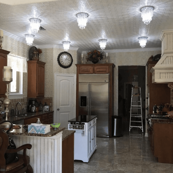
6. Is someone buried here?
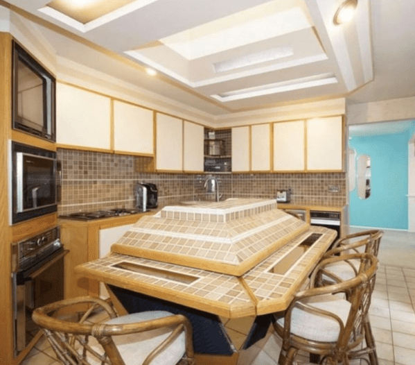
7. Honestly? I could never leave this one.
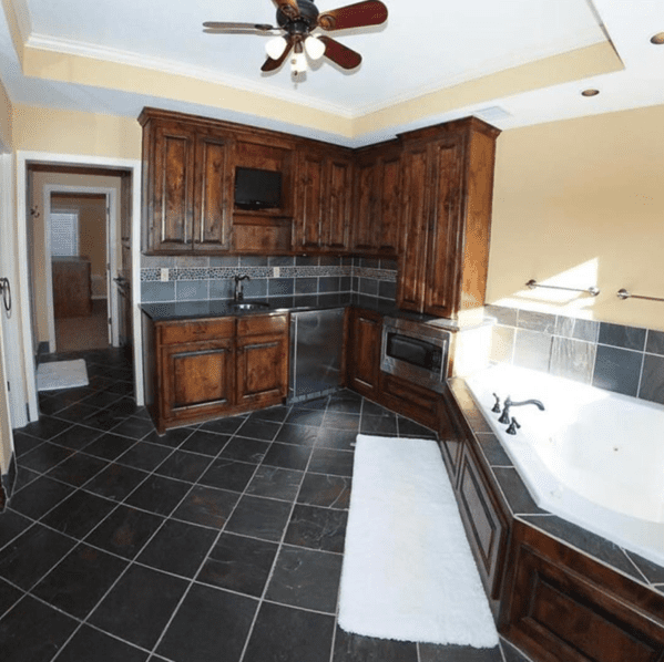
8. Designed by the Looney Tunes writers.
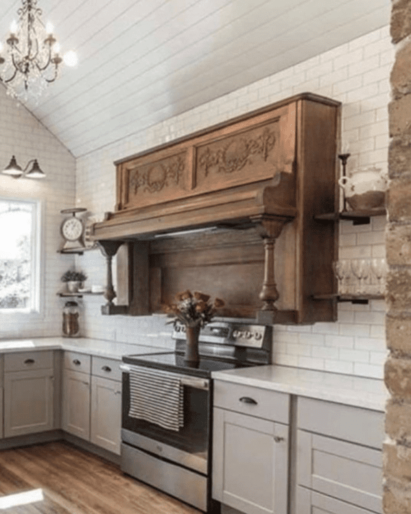
9. For anyone who hates counter space.
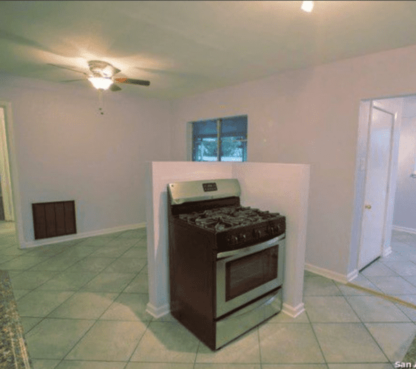
10. The person on the left is screwed.
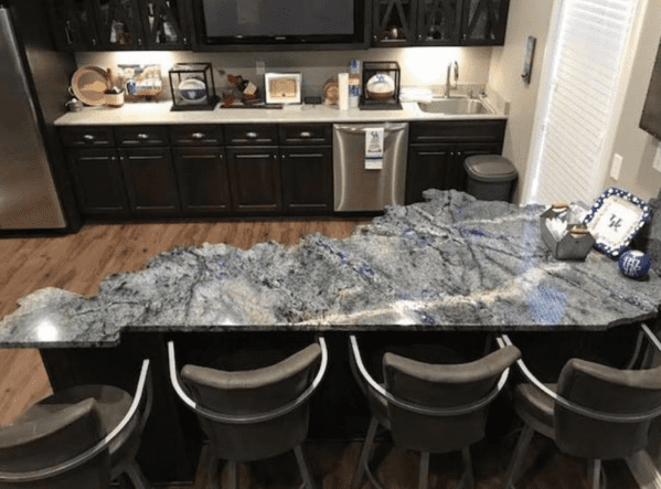
11. The oven looks shocked to be here.
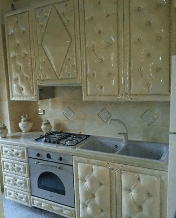
12. Talk about multitasking!
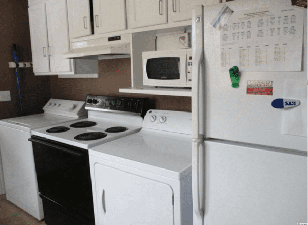
13. This is so painful.
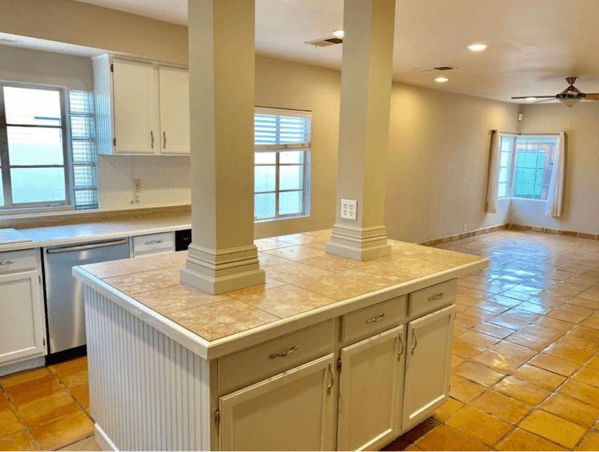
14. It hurts to look at.
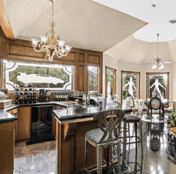
15. The least functional kitchen ever.
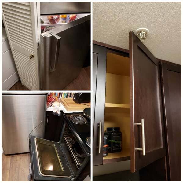
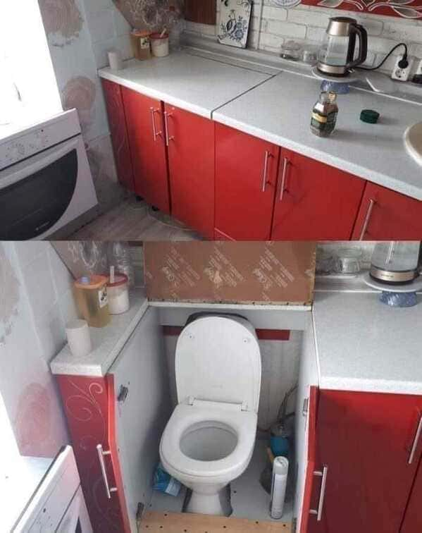
16. It’s an all in one!
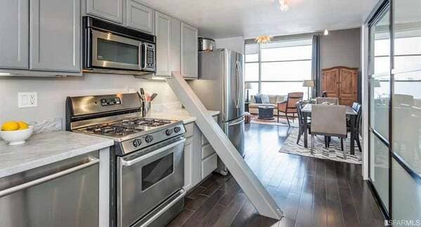
17. This San Francisco townhouse has a beam running through it.
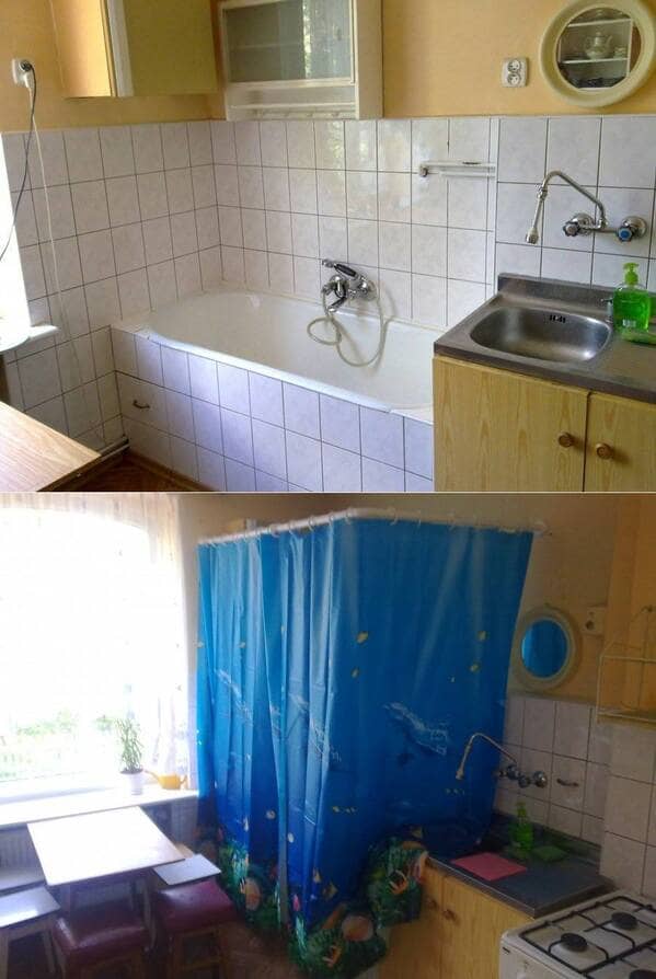
18. An efficient way to get ready I guess?
19. And finally, this kitchen with splatter style counter tops that look like mold spores.
