Designer Gives The “World’s Worst Logos” A Glow-Up (9 Pics)
Designing logos that are eye-catching, memorable, and don’t resemble human genitalia (like some of the worst logos) is a skill that not every designer has.
So Italian graphic designer Emanuele Abrate took it upon himself to redesign a series of terrible logos that were sorely in need of help. He reimagined these designs and turned them from head-scratching or accidentally suggestive into clean, beautiful logos.
Honestly some of these designs are truly awful and call to mind the infamous “E Pluribus Anus” logo from Community.
Needless to say these designs were desperately in need of a glow up.
1. This logo looks like King Kong planting his ass on the Empire State Building. Much improved!
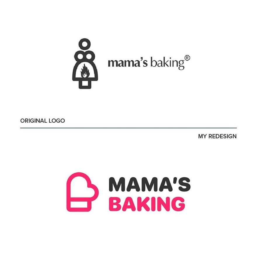
2. Not sure what’s going on with Mama’s Baking but she looks in distress. Much better!
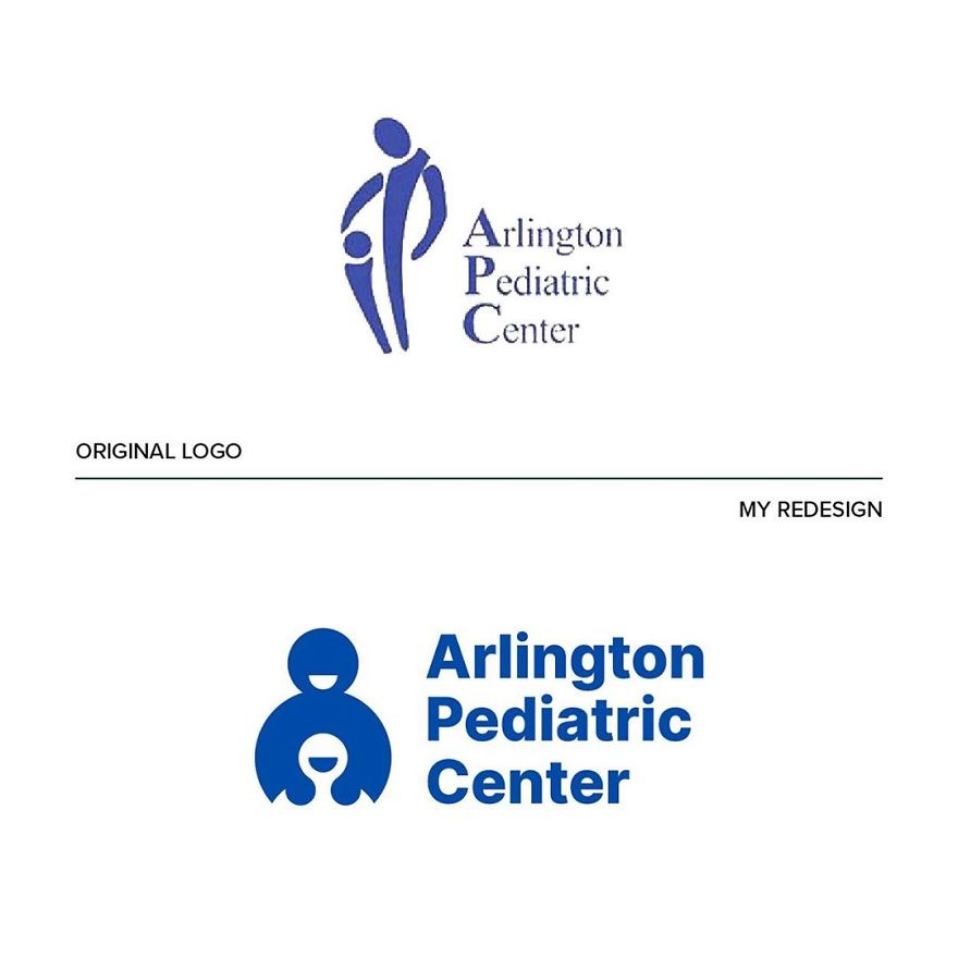
3. Looks like a birth canal. REDESIGN!
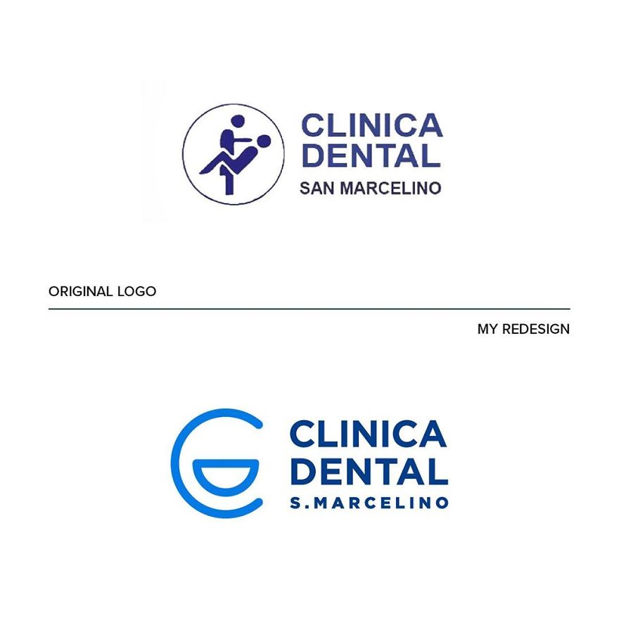
4. The figure in the original design looks like he’s being threatened by his dentist. A smile is better.
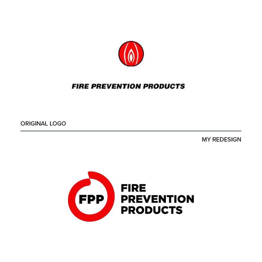
5. OK that logo looks like it’s either a dick or a mouse. Huge upgrade.
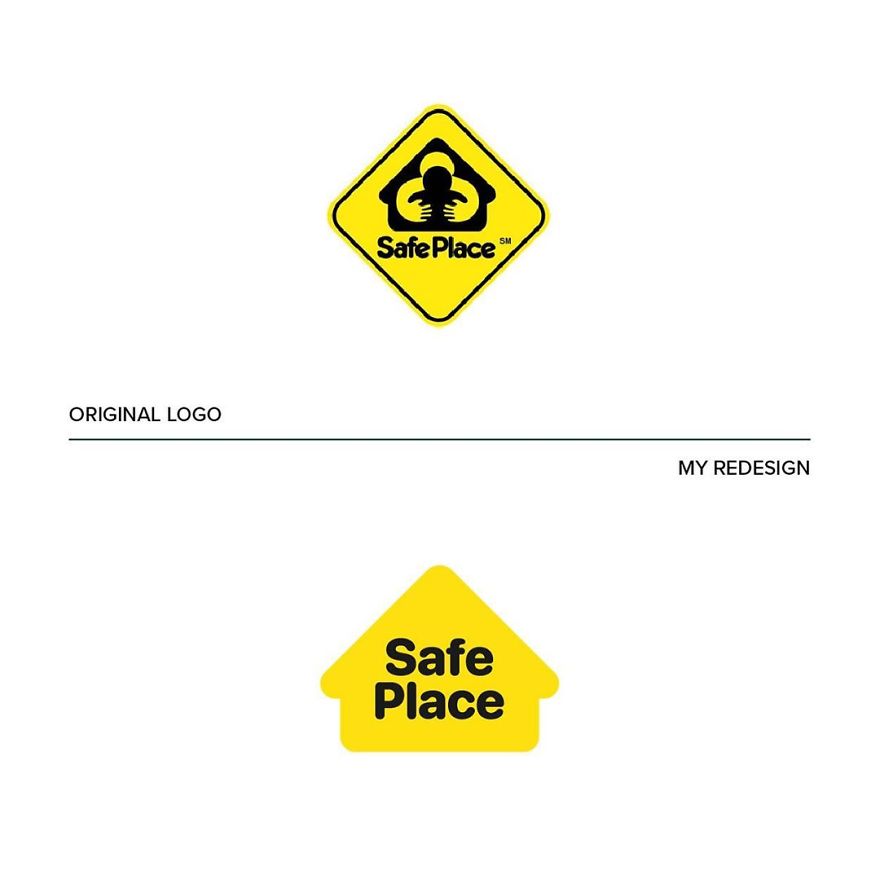
6. “Safe” is not the feeling you get from the original design.
7. Before: Messy. After: Clean

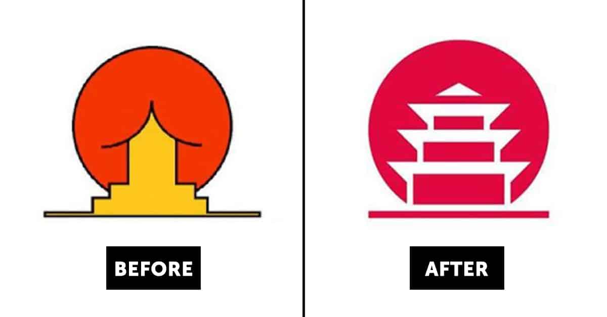
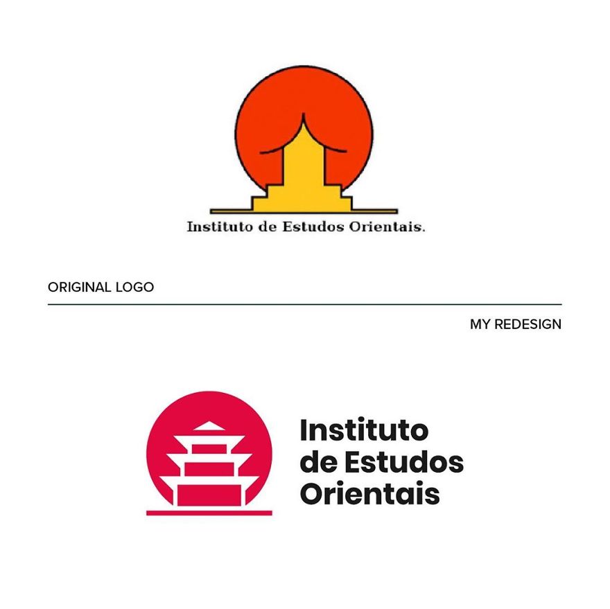
8. From drab to fab
9. The original design just looks wrong…