People Are Sharing Terrible Modern Home Trends (20 Posts)
McMansions have rightfully been mocked to death, but we haven’t talked as much about the “builder grade” decline we’ve all just come to accept. Cheap, quasi-crappy material that you’re going to have to swap out gets slapped into homes so they can sell fast.
Redditor u/wazzel2u recently asked Reddit:
“What is a terrible trend found in new home design?”
And I found myself nodding along as I scrolled through some of the best responses. I’d add “closet doors” because, having just completed man’s most difficult task (replacing closet doors), I never want a home with builder-grade doors again.
1. Faux fronts
Go to a high end gated community development ($800k – 2M price points in my area) front of the homes is beautiful stone, brick, etc but on the back every house has cheap ugly vinyl siding all the same color as far as the eye can see. I never understood this since you actually spend time in the back yard not the front.
2. Open concept bathrooms
No door between the master bedroom and master bathroom. It’s so annoying.
The last 3 houses I’ve lived in have had this issue. I like to be able to close the door when I take a bath or shower.
3. So many rooflines
I don’t like it when they have like ten different rooflines that are only a foot or two deep. Are they hoping it looks like an older house that’s had many add-ons done?
4. No storage
Lack of storage space. Just bought a new home and didn’t realize how little space there was. We have one storage closet upstairs. That’s it.
5. Crappy doors
Hollow interior doors that don’t keep sound out from within the house and hallways – especially hollow bedroom doors when you’re trying to sleep.
6. Oh no, Brooks!
Removing stair banisters for a crisp look. Like your drunk friend Brooks is going to fall off the side and die one day. There are building codes for reasons.
7. Small bedrooms
Bedrooms that are only juuuuust big enough for a double or queen bed and a nightstand.
8. Sinks
Most sinks are absolutely terrible. Looking better is nice, but not at the expense of hitting your hand on the bowl every time you wash your hands.
9. Cramped garage
Garages that fit two medium sized cars with about one inch to spare
10. Developments
The grotesque housing developments of the same like 4 models and 3 colors with no trees. Not to mention the houses are built like shit. The terribly inefficient road layout with a million cul de sacs.
11. Smol
Small laundry rooms, small pantries, no linen closets, but here’s a 20×20 media room to watch TV. My next house will either be laid out by me or made in the 70s/80s when they designed homes to be lived in.
12. Fake balconies
Those dumbass fake balconies
13. Cabinet doors
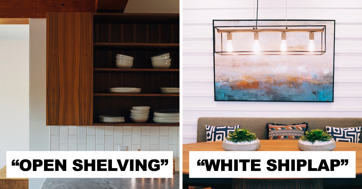
I don’t know if it’s new new, but it drives me crazy when people replace cabinetry with open shelves.
Don’t people understand dust? Bugs ring a bell? Pet hair? Speaking of pets, how do you keep your cats from messing around with that setup?
14. Cut corners
Homes built on the cheap with so many corners cut in their construction that they end up being horrible places to live in, plagued by mold, damp, noise and plumbing issues and more.
15. Warring factions
I have not been inside a new home in quite a while, but the exteriors seem to be designed by a committee of people who can’t work together. Every possible exterior finish is on there, faux brick/stone, stucco, siding at all angles, board and batten, shingles/shakes, you name it, some part of the house has it, often in disparate colours. It looks very bad.
16. White fucking shiplap
All white, white carpet, white furniture, white fucking shiplap.
17. Pot lights
As an electrician; putting 600 potlights in every room of the house. Sure it makes me money but it looks fucking ridiculous having so many lights every 4 feet of every room.
18. Cold and sterile
The cold and sterile look. White, black (high polish please so you see every single fingerprint)… why?
19. I love this poster
WORDS do not belong on walls! It’s like somebody went to Michael’s crafts and decorated their home. EAT. ‘Kitchen’. ‘Wash your hands’. Any iteration of ‘In this house….’. I loathe that trend.
20. Rushing
Rushing the building process just to get the house finished as fast as possible. One of my sister’s friends moved into a new house a few years ago and her dad found out while decorating that one of the walls of a room was at an 85 degree angle or something like that. Really badly designed house.

