33 Restaurant Design Fails That’ll Make You Lose Your Appetite
People care more about food than about nearly anything else. So when you’re in the business of feeding people a lot of things can – and do – go wrong.
There are a slew of ways that a restaurant can drop the ball in its design resulting in a space that is confusing, uncomfortable, or downright unappetizing. Some of these crappy designs stem from honest mistakes like translation errors, cultural misunderstandings, or building constraints. Other restaurant design fails are more inexcusable…like plate designs that never look clean or toilets with glass doors.
In fact, a lot of these problems involve the bathroom for some reason. As the saying goes: Don’t shit where you eat.
With that said enjoy these restaurant design fails and Bon Appétit!
1.
These tables at a restaurant that will destroy your kneecaps
byu/NavicNick inCrappyDesign
2.
All plates at this restaurant have this pattern that resembles a single human hair stuck at the edge
byu/7-methyltheophylline inCrappyDesign
3.
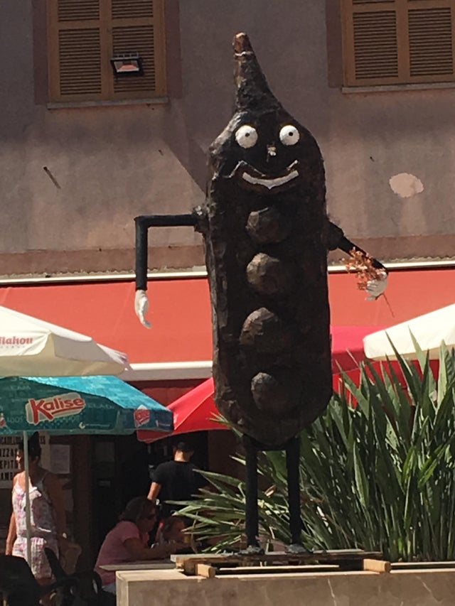
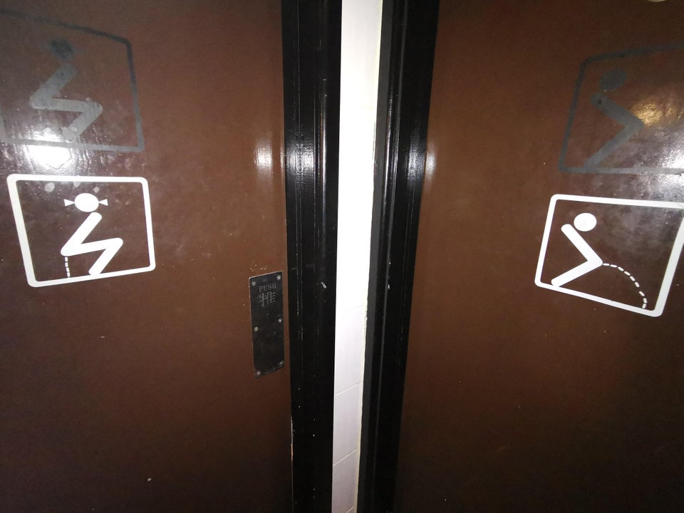
Went to go to the bathroom at a local restaurant and found a literal “crappy design”
byu/FritoMatt inCrappyDesign
4.

5.
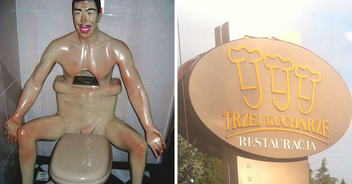
Found this masterpiece at a local restaurant
byu/Ysoshes inCrappyDesign
6.
This painting inside a local “fancy” restaurant.
byu/hotdogfinatic inCrappyDesign
7.
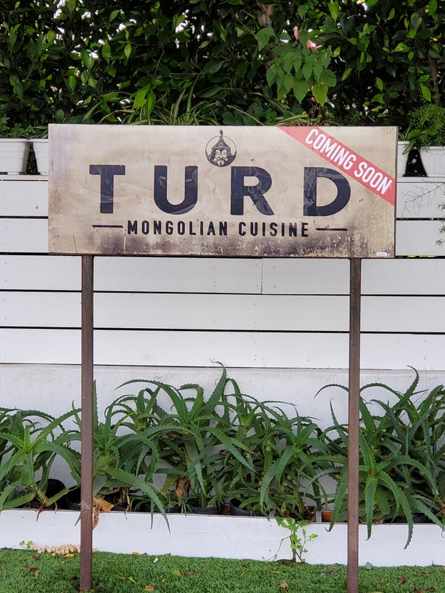
Two different restaurants. No affiliation. Located just up ahead.
byu/Your_Local_Engineer inCrappyDesign
8.

9.
10.


