50 Product Designers Who Were Actually Thinking About Customers
Have you ever opened a bag of chips to find it only about 1/3rd full?
Or, how about, have you ever tried to use an Apple charger in an electrical outlet but couldn’t because one was already there, taking up all the space?
Those are both examples of “asshole design” and quite the opposite of what these following products and features are all about.
Turns out some designers, for no reason and often at the expense of the company, design their products to make them easier, more informative and generally helpful.
Known as “anti-asshole design,” there’s a whole subreddit devoted to examples of what they call “design that benefits the user at the expense of the company. Any feature, however easy to implement, that helps the user and makes the company no money (and cannot be advertised) is anti-asshole design.”
Here are some of the most clever examples of “good,” anti-a**hole design.
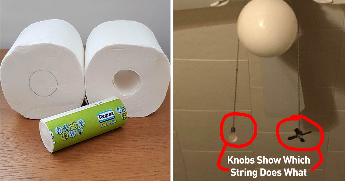
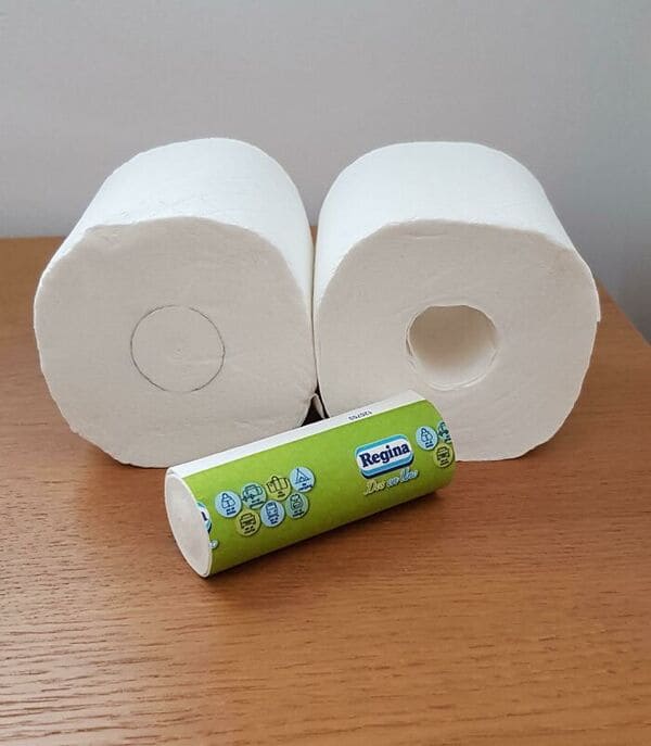
1. Whoever designed this toilet paper roll that includes a mini-roll inside, instead of a hollow tube.
2. The designer of this sign that someone “found in the ladies’ restroom.”
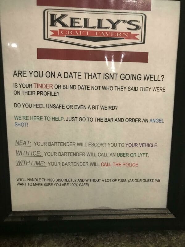
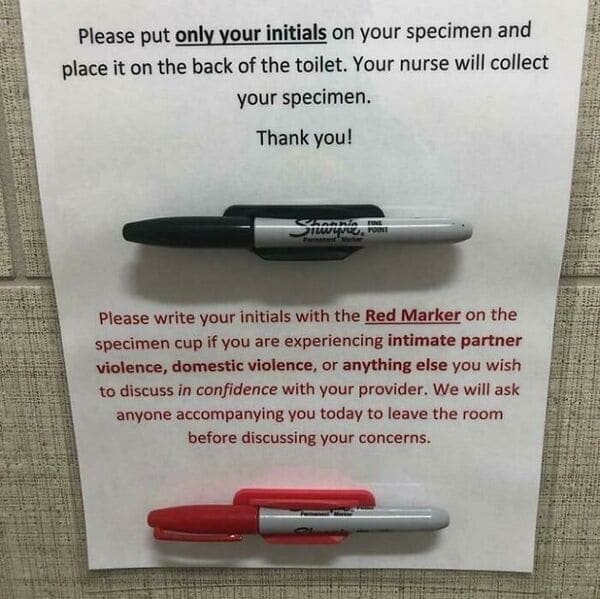
3. Whoever came up with this subtle way to offer aid to domestic violence victims.
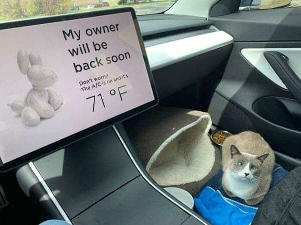
4. Tesla’s interior tech designers.
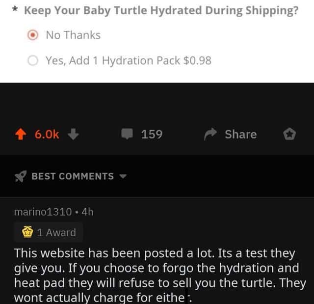
5. The people behind this service for buying a pet turtle.
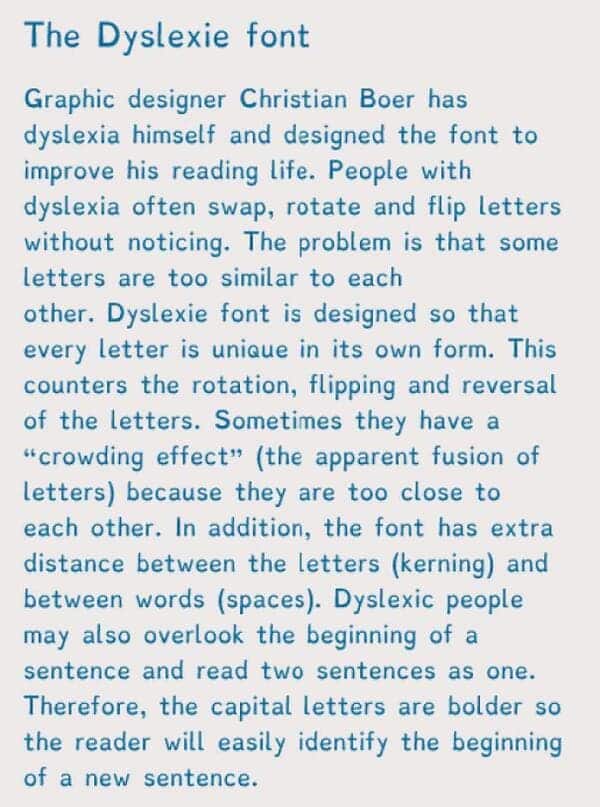
6. The inventor of the Dyslexie font.
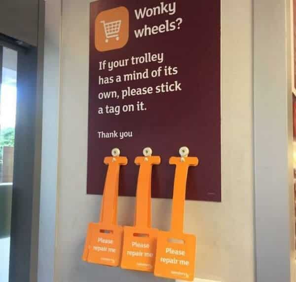
7. Whoever came up with this easy way to get shopping cares repaired.
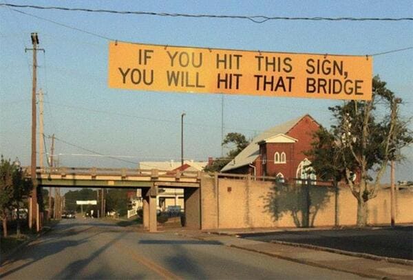
8. The city planner who was tired of his bridges getting hit.
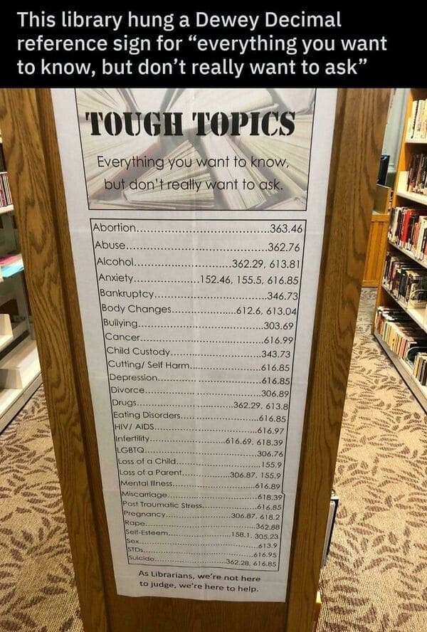
9. These librarians.
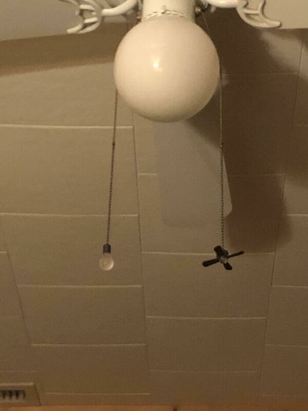
10. The inventor of these strings that show you which is the light and which is the fan.
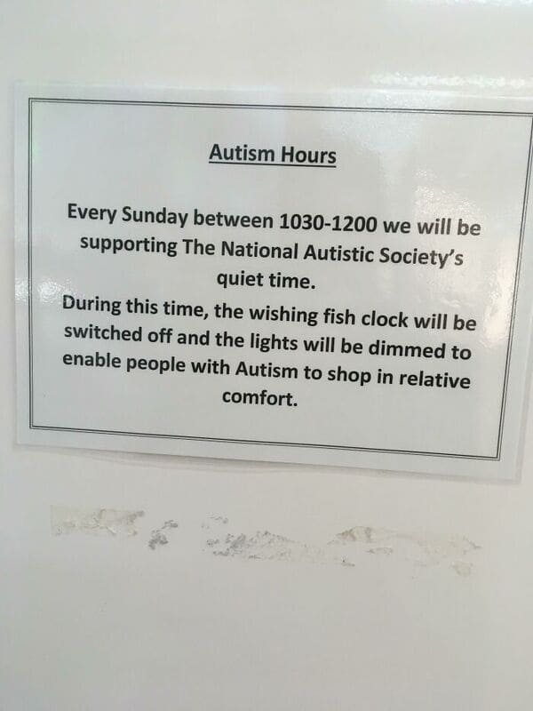
11. This local shopping center that has a designated time for being Autism friendly.
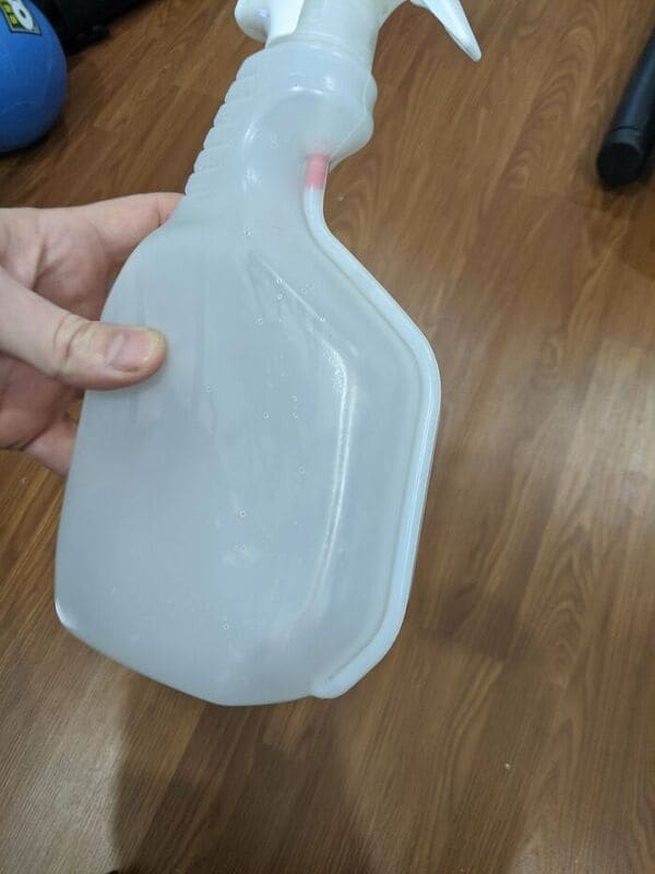
12. The inventor of this spray bottle that makes sure you get to use all the liquid in it.
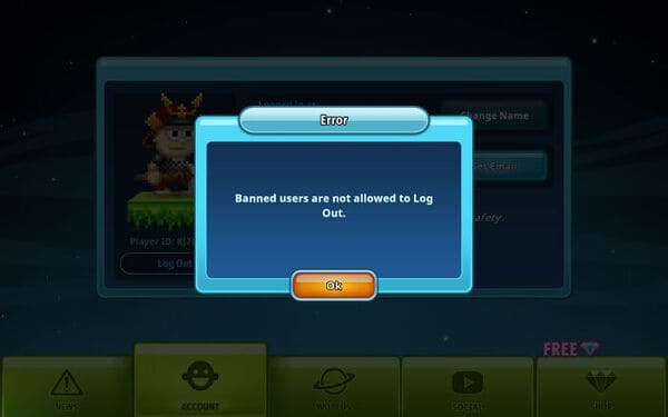
13. This designer, who figured out how to keep a-holes from making new accounts.
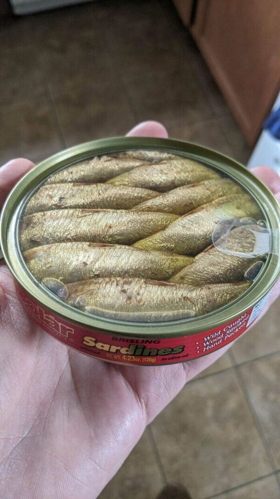
14. The makers of this sardine can with a transparent lid.
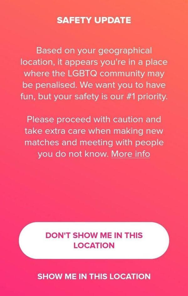
15. The designers at Tinder, who have your back even when the government doesn’t.
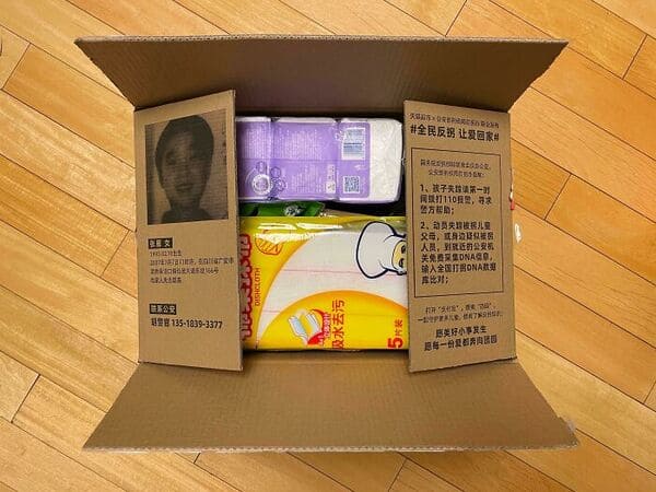
16. This company in China that uses its shipping boxes as flyers for missing people.
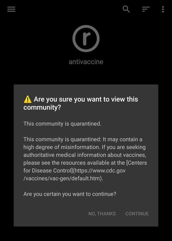
17. The moderators of Reddit, who show you this warning before you enter the Anti-Vax communities.
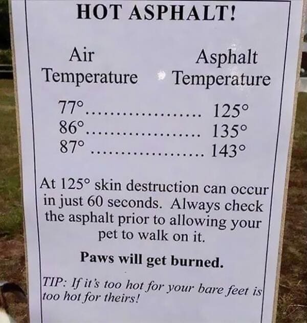
18. The people who gave us this friendly reminder.
19. This photographer, who planned ahead by adding a gap in the picture to avoid losing people in the binding.

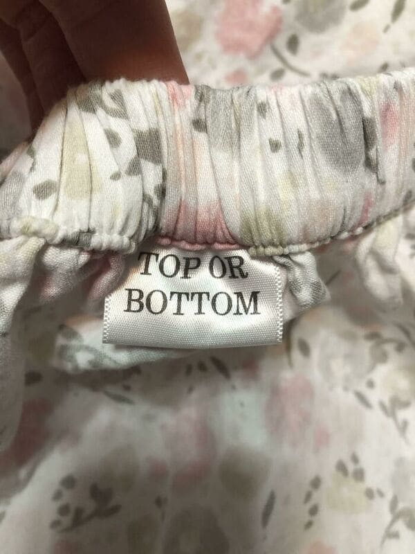
20. The makers of this fitted sheet tell you if it’s the “Top/Bottom” or the “Side.”
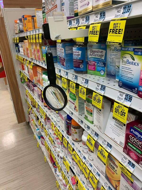
21. Rite-Aid puts a magnifying glass by its products people can read the medicine labels.
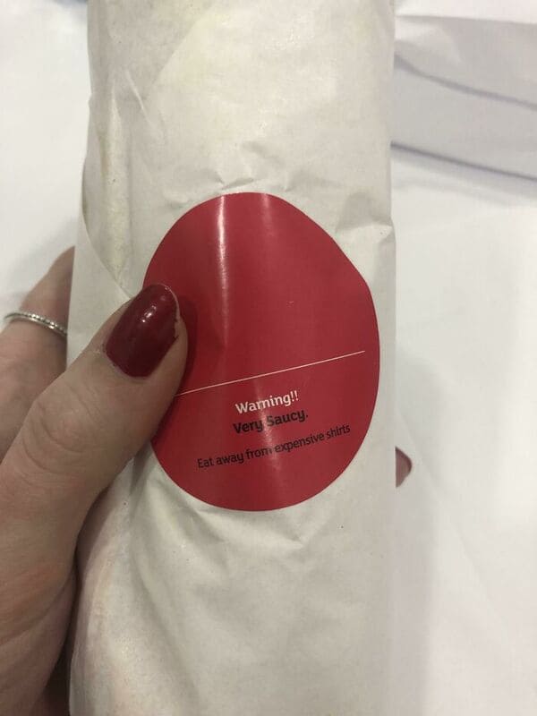
22. The makers of this sauce warning.
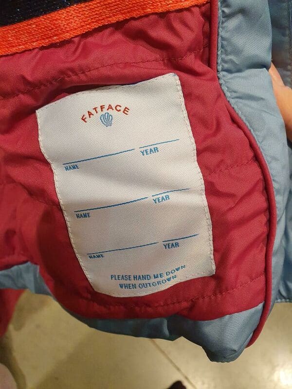
23. This Children’s clothing company that prepares for multiple owners of a hand-me-down coat.
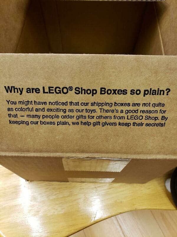
24. The people at LEGO.
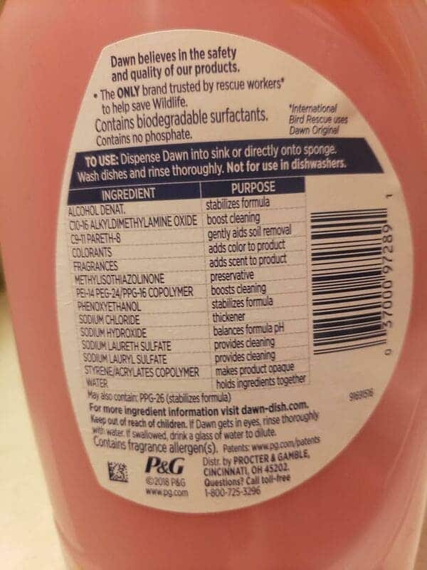
25. Dawn’s genius idea to actually tell me what all these chemicals do.
