This Map Shows Each State’s Least Favorite Other State
Writer Matt Shirley makes a new chart every day. While that may not seem like a huge accomplishment, I assure you coming up with an original idea consistently is no easy feat.
Matt started out sketching charts on a dry erase board, but soon evolved to digital charts. Now he is commissioned to make charts for money. I love it when someone starts out making something fun on social media and it turns into profit.
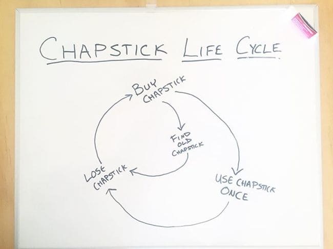
The chart that started it all:
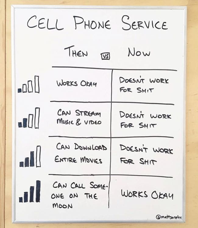
Maybe the most accurate one he’s done:
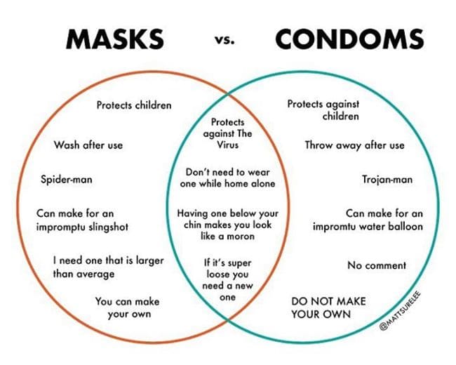
And I mean, I love a good Venn:
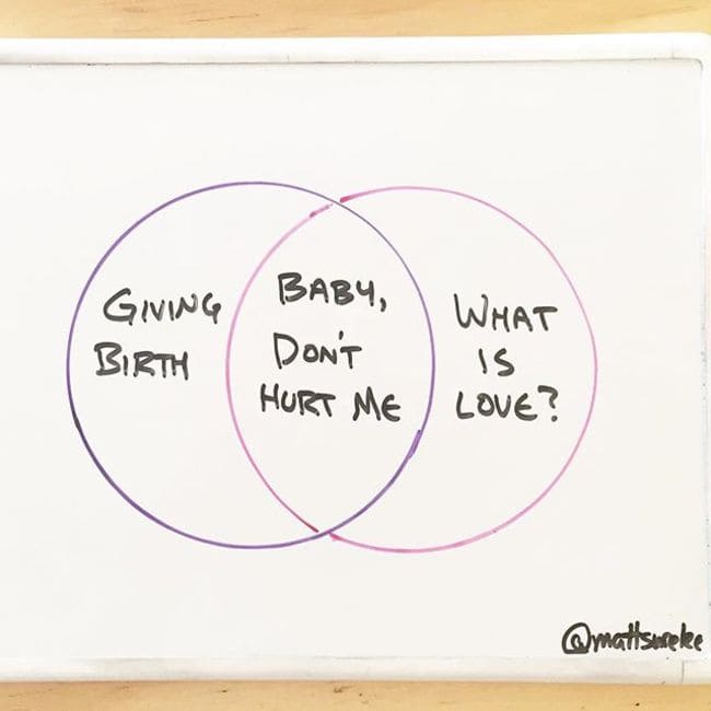
They do look a little more professional when digital but the content is always great.
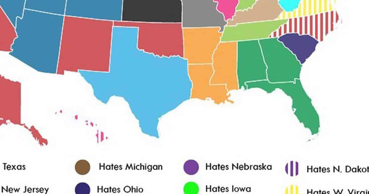
As Matt’s following has grown, he’s been able to crowdsource data to make his charts more accurate. One of my favorite examples of this is his most recent one.
Matt polled his followers asking what state people from their state hated the most. Now, if you’re seeing your state on there and thinking “Hey, what the hell? We hate _____ state a lot more!” Relax. This is a poll from thousands of people on the Internet, so you are wrong.
Anyway, as a native Alabamian, I can say the Florida hatred certainly checks out. How accurate is it for your state?

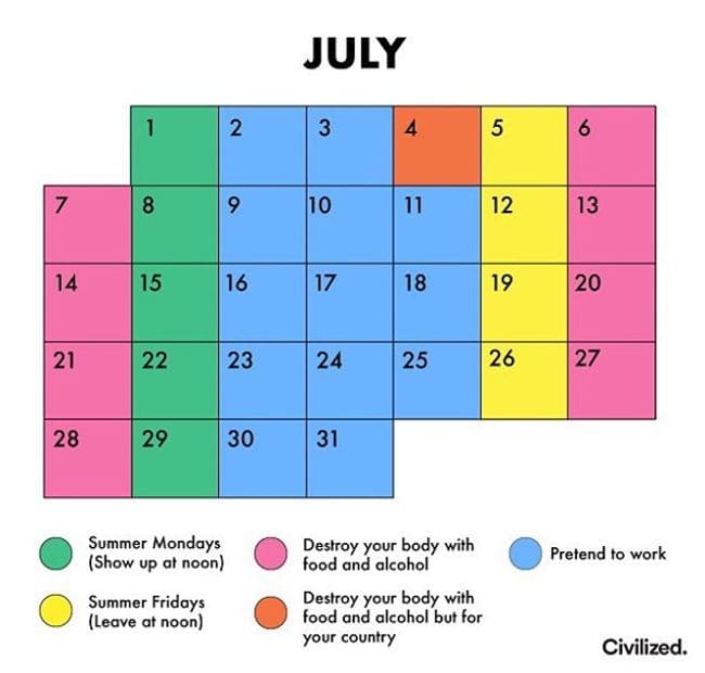
Oh, and while we’re on it…
I can’t recommend Matt’s page enough. Follow him on Instagram and participate in his future polls. I look forward to seeing more of this weird country for what it really is.