Follow-Up To “Most Hated State” Map Shows Each State’s Favorite Other State
Writer Matt Shirley makes a new chart every day. While that may not seem like a huge accomplishment, I assure you coming up with an original idea consistently is no easy feat.
Matt started out sketching charts on a dry erase board, but soon evolved to digital charts. Now he is commissioned to make charts for money. I love it when someone starts out making something fun on social media and it turns into profit.
The chart that started it all:
View this post on Instagram
Maybe the most accurate one he’s done:
View this post on Instagram
I love a good Venn:
View this post on Instagram
They do look a little more professional when digital but the content is always great.
View this post on Instagram
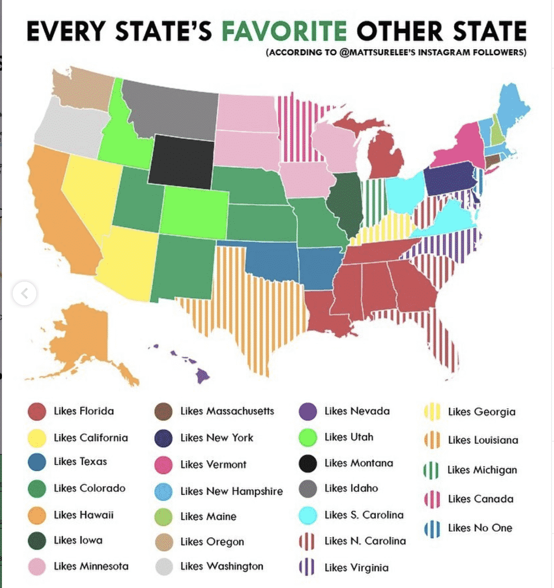
As Matt’s following has grown, he’s been able to crowdsource data to make his charts more accurate. One of my favorite examples of this is his most recent one.
Matt polled his followers asking what state people from their state hated the most.
In case ya missed it:
https://www.instagram.com/p/B7bkVkZnogM/
Now Matt is back with the much-anticipated follow-up, and admittedly more positive take on states that other states love the most:
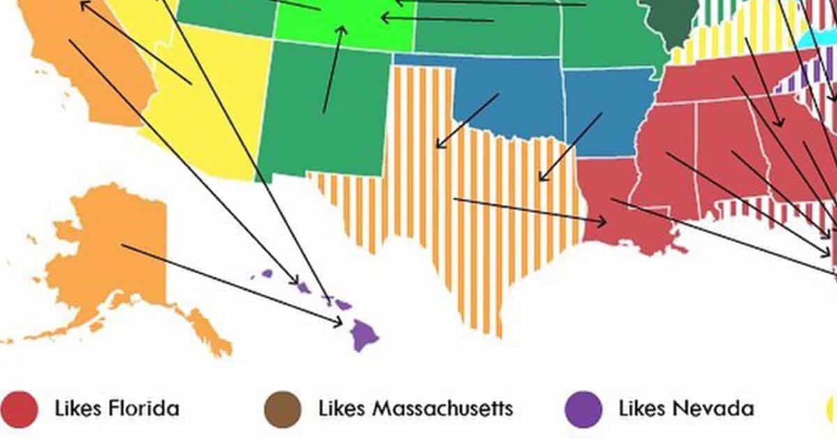
And here’s a version that highlights a little more clearly (or confusingly):
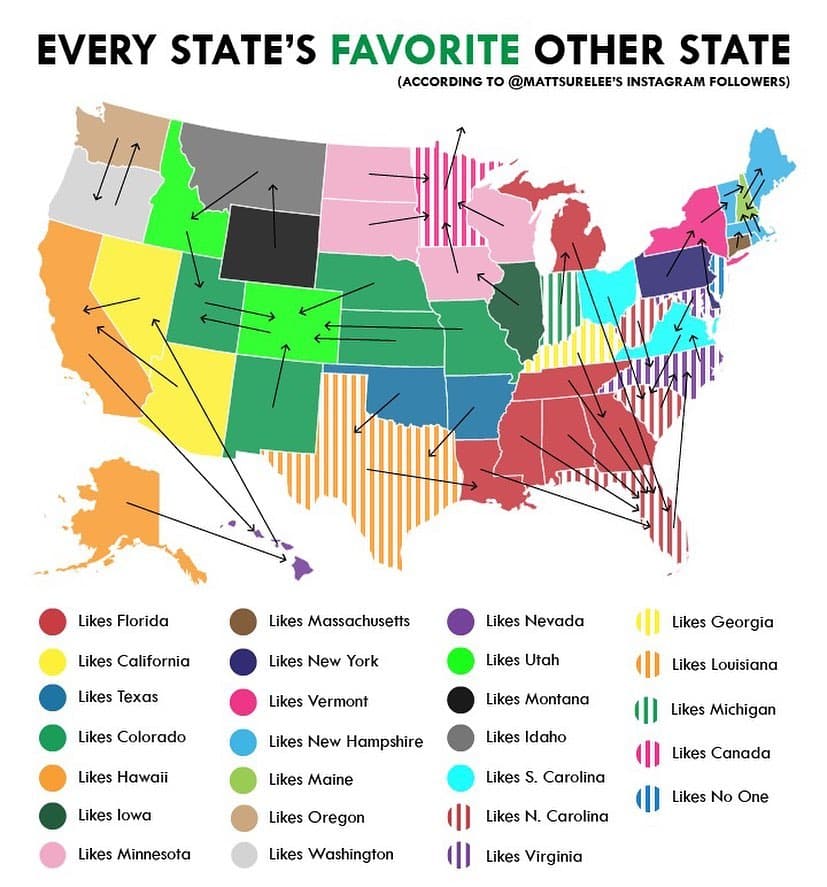
What do you think? Does it check out for your state?